Data and stories
Data about communities is used to make a lot of decisions that impact the people who live and work in the area.
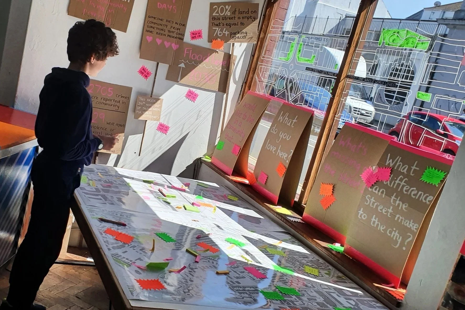
We are exploring how to share that data in ways that make it more meaningful, relevant and prompts action. This page shares some of the ways we have done that recently.
Now we are working with the University of Plymouth on the Stories of Us project which has created the opportunity to work together with others to do more around data and stories.
Data scarf
This hand knitted scarf shows:
the size of the empty buildings we are bringing into use (every four stitches = 1 sqm)
the date we took them on
the number of people who invested in them
how long they had been standing empty
the amount of retained carbon saved by reusing the building
the 6750 sqm of land still standing empty on the street
how many annual street parties we’ve had (17 so far!)
Find out more and have a look at why we made it in this short reel.
Transport data bike
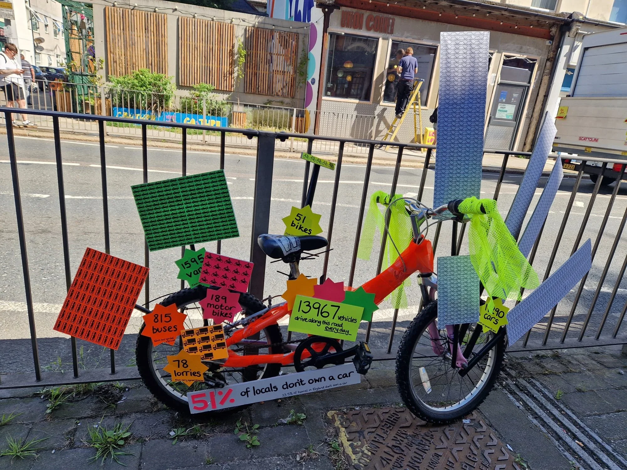
A bike out on the street shares the stats about how much traffic travels along the street on an average day - 13,976 vehicles!
Only 51% of local people own a car.
Every symbol on these signs = 10 vehicles
Journey of nudging tapestry
This banner creates a visual story of the feelings and complexity we have experienced nudging so far.
This blog shares more about the first few sections and how it relates to what we experience making change happen, then we carried on adding to it so this shares the meanings behind the following sections.
Watch a short film about what it all means here.
Crime data
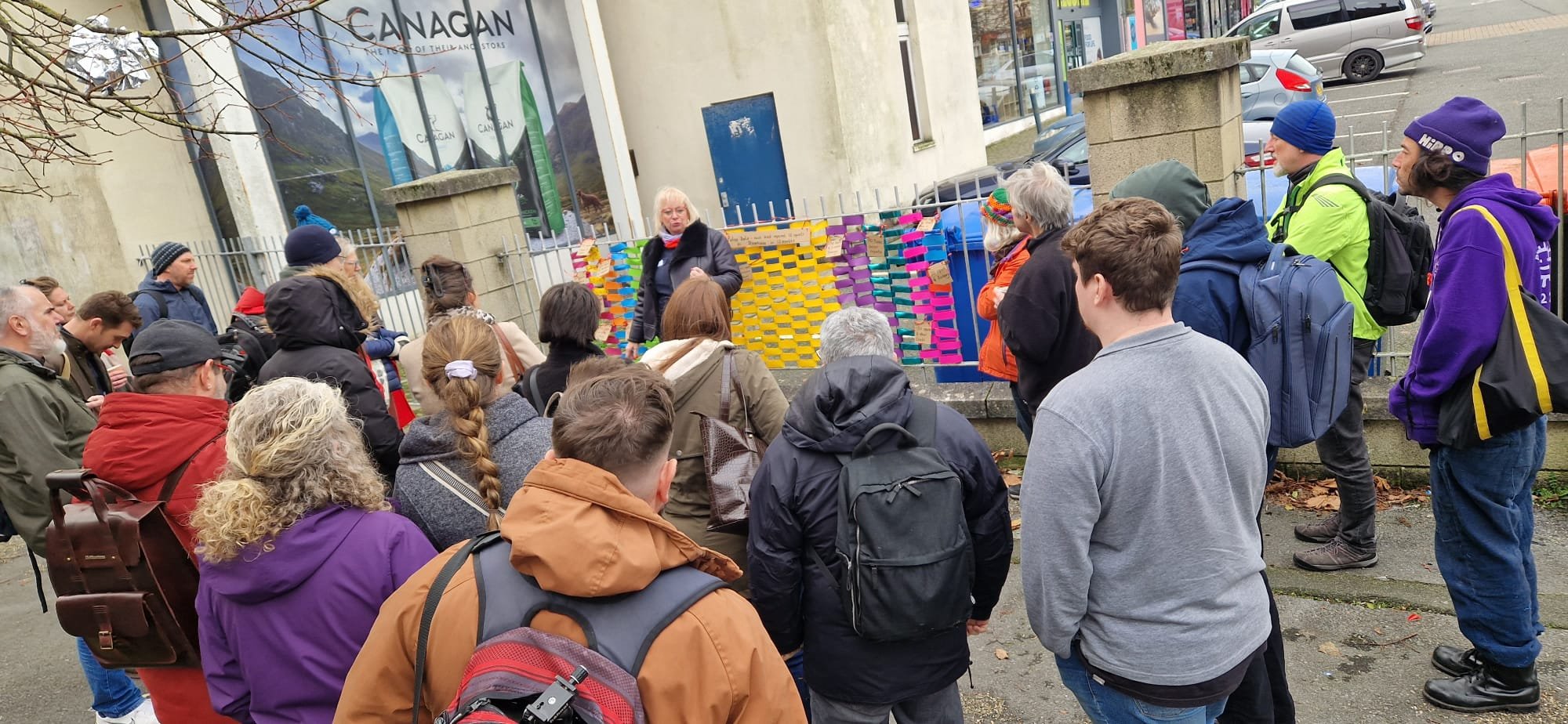
Each coloured band on the railing represented 10 reports of a crime on the street over one year. The colours represented different crimes.
We held conversations about how it feels and what people notice when we look at this data out on the street where it happens.
Population data
Population data is often grouped together in a way that hides local patterns.
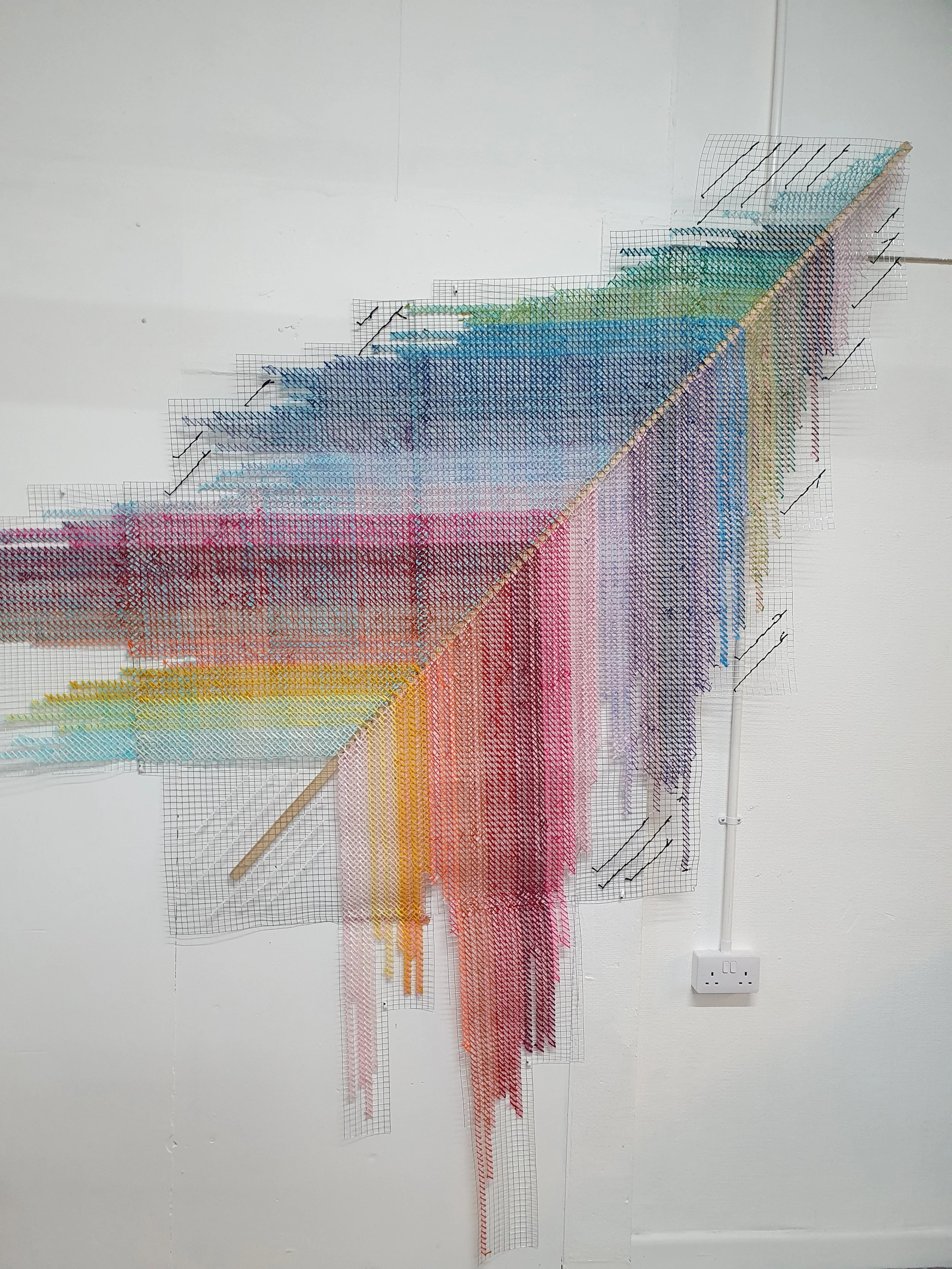
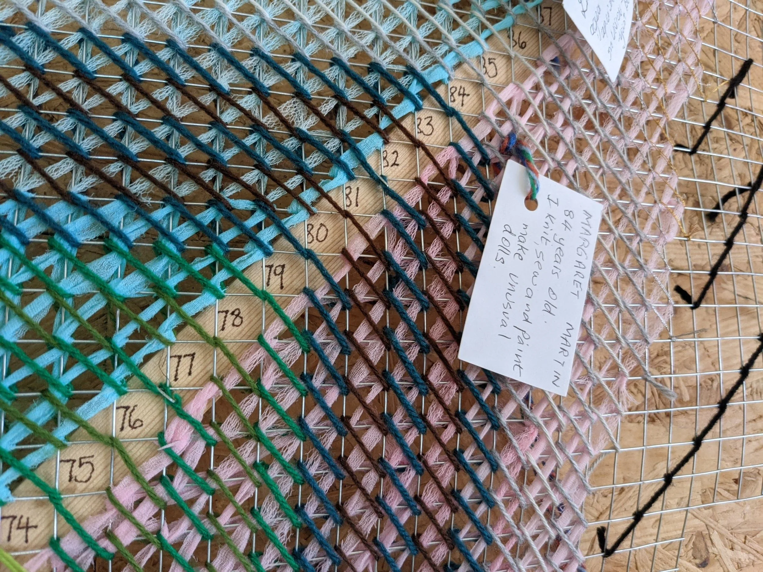
This is a giant cross stitch where:
every stitch represents one person
one part of the cross stitch represents gender (only male or female are included in the data)
the other colour on the cross stitch is someones age
white stitches at the bottom show the number of people born each year
black stitches show the number of people who die
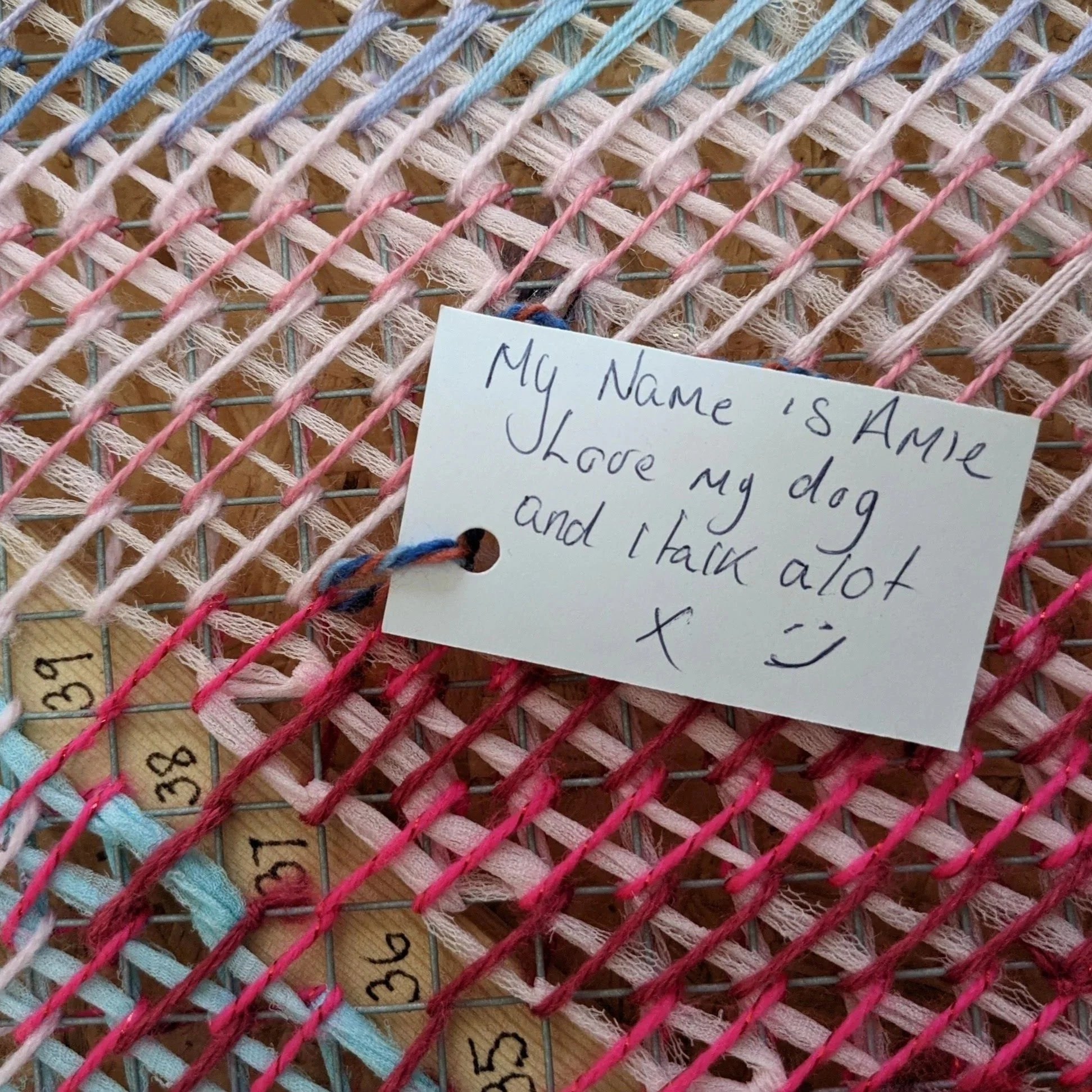
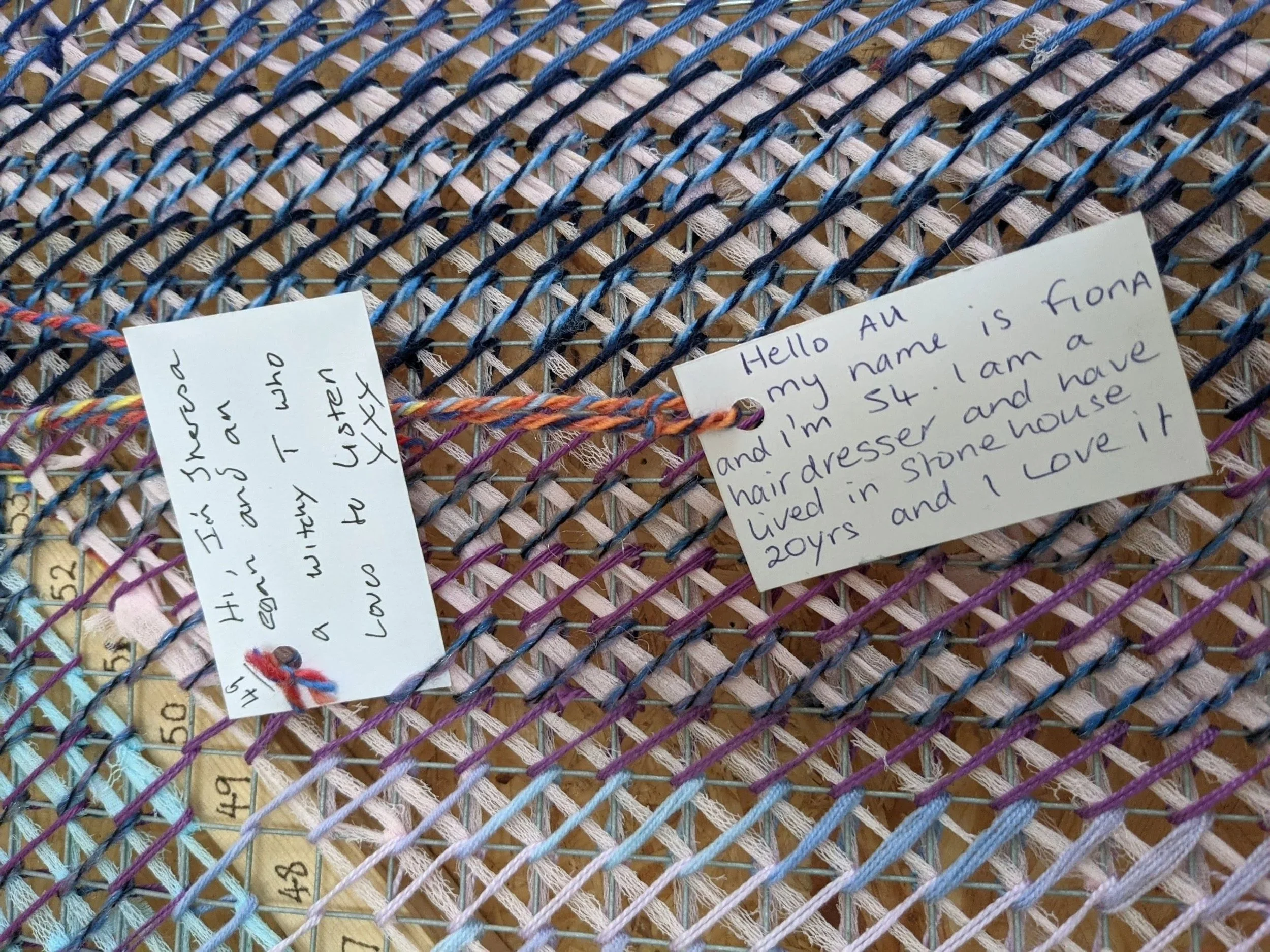
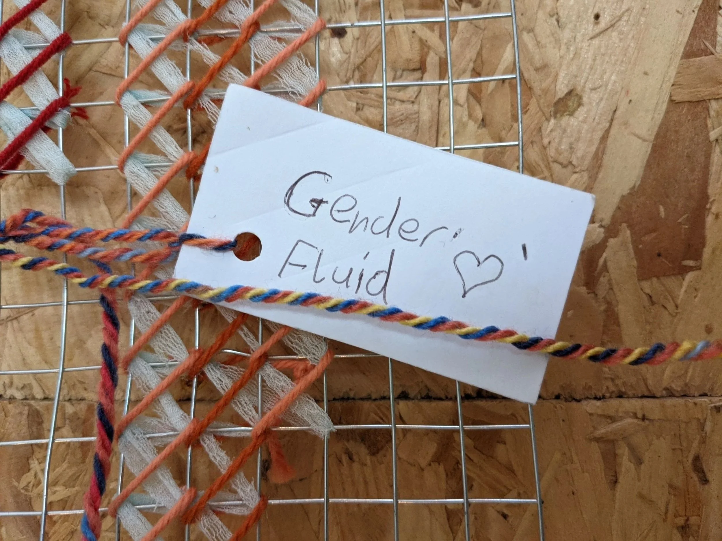
local people were invited to add a tag with data about themselves to show the community behind the data